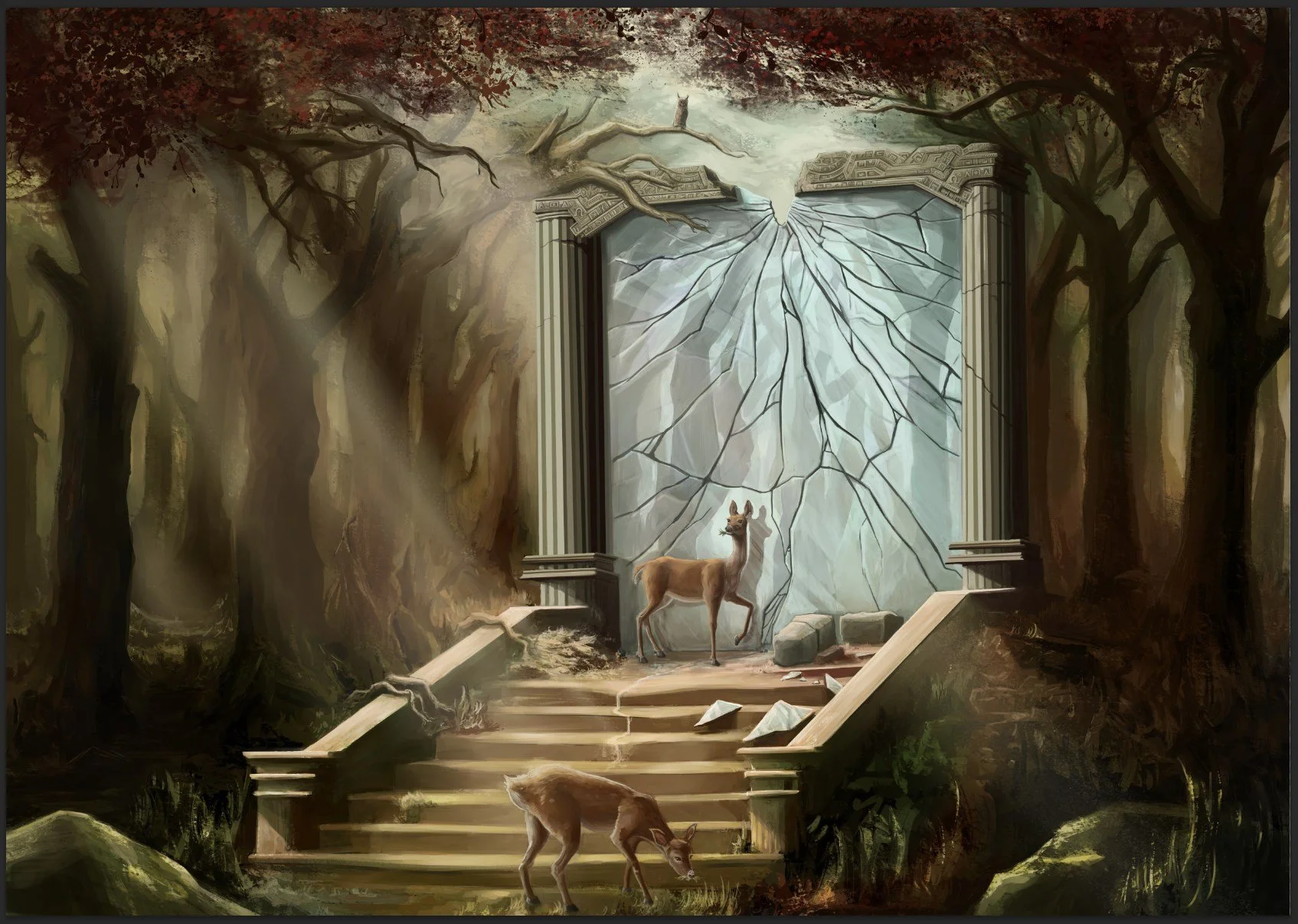
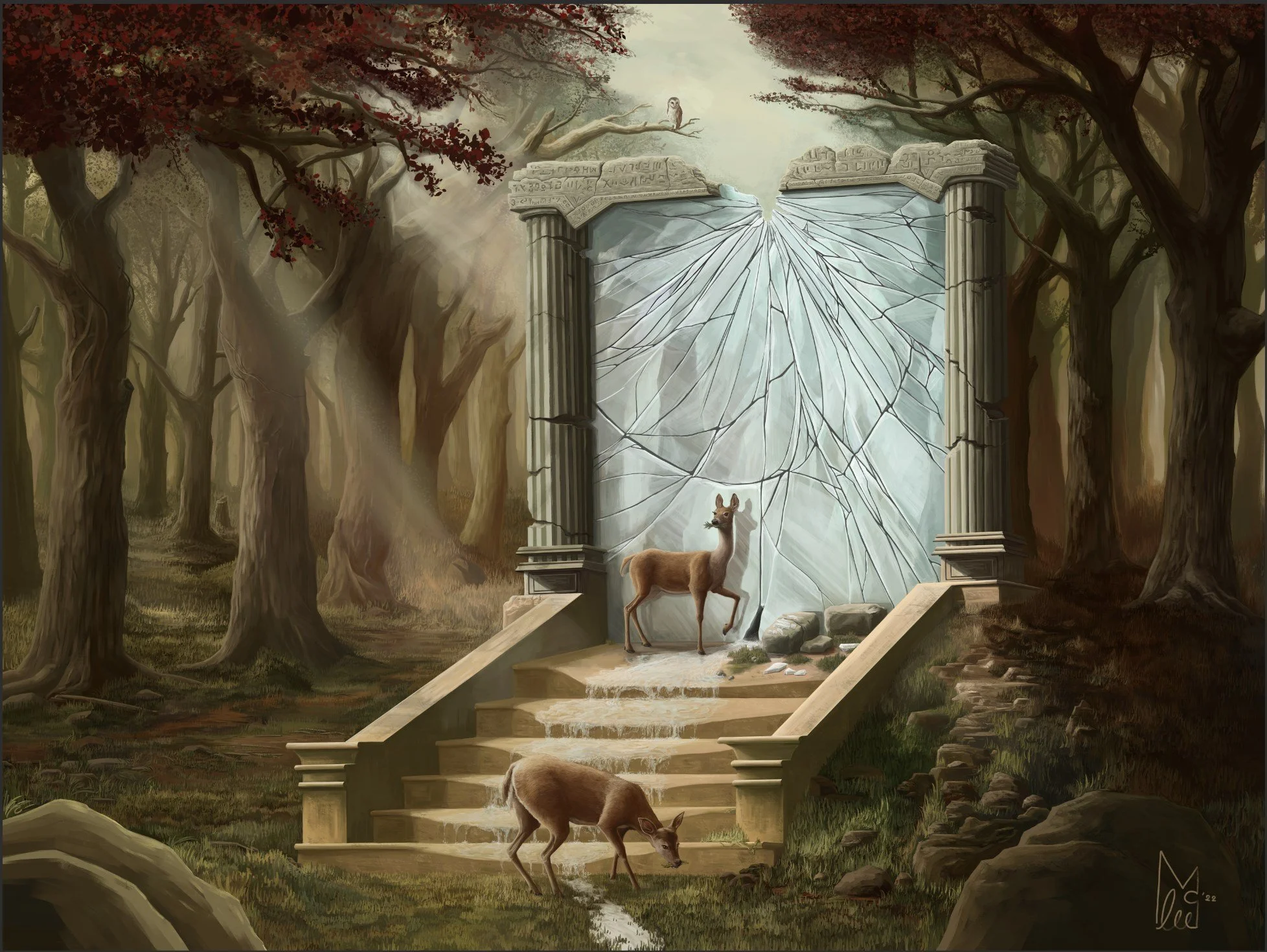
“Five”
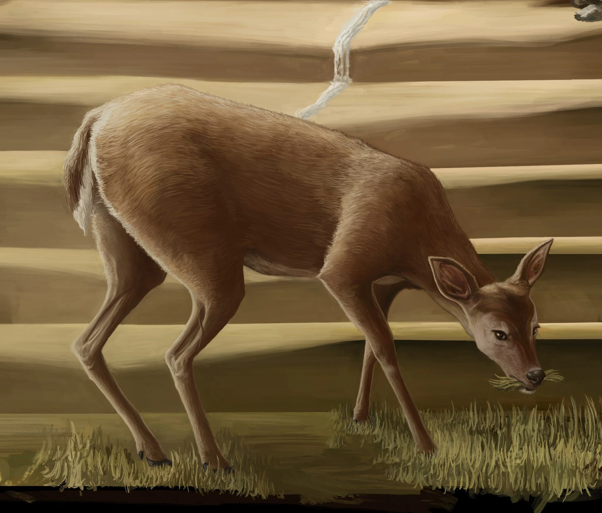
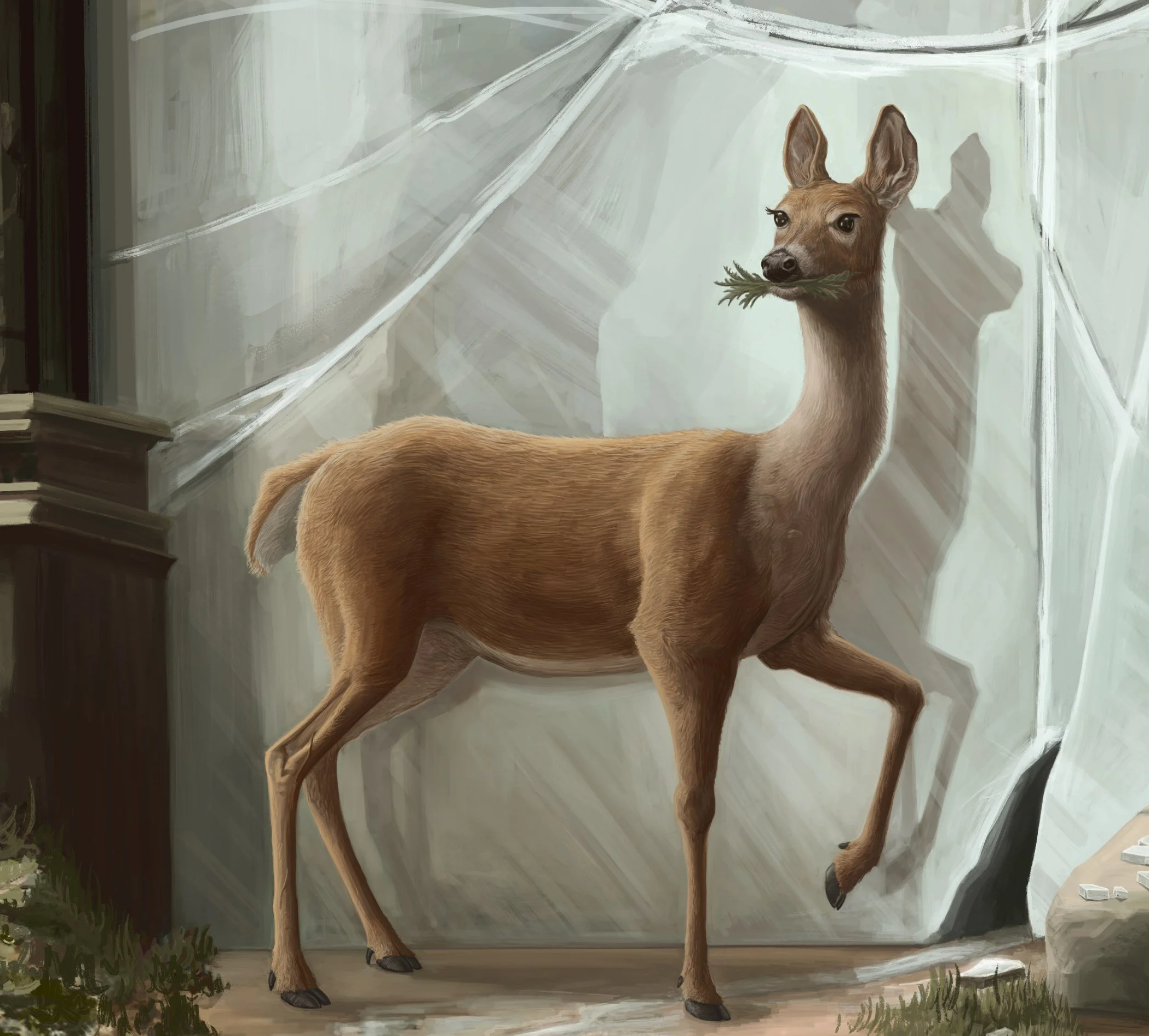
This fantasy art piece took me over a year of working on it. It started as a sketch and slowly over months and months of work evolved into the full composition you see here, and at some point midway through drawing I decided that my art prints were too small, made the decision to redraw it from a 16x12inch size up to a gigantic 40x30 inch canvas, making my art program and computer freak out a bit. Its also the reason it took so long to draw, I really went for a ridiculous amount of detail. The deer have individual hairs on their bodies.
Every part of this artwork has been painstakingly redrawn over and over again until it felt JUST right, and now I'm finally happy with it. I hope you enjoy it too.
If you would like a print of this artwork you can select your size and add it to your cart below!
How I created it
This was my original sketch, I was noodling on a photoshop document and thought up this little simple idea. I started this all the way back in March 2021
Lets redraw it at a different angle and add more around it to make a scene. Originally I was going for much more trees all pressed up against each other to add more claustrophobia and menace to the scene. Turned the archway into a giant mirror and thought having it cracked would make for an interesting story.
A whole day of painting and we have a full composition and some laid out! The mood is really coming through on this now. This is only a value sketch on a 16x11 inch canvas though, theres a LOT of work still to do…
This is when I started migrating from Photoshop to Clip Studio Pro and resized the canvas to 40x30inches! Now the daunting task of going through every part of the image and adding in all the ridiculous detail that canvas size allows. I started by opening up the trees more to allow in more light, and more sunlight bouncing off the mirror shards.
I can also start adding detail into the deer now I’m happy with the pose.
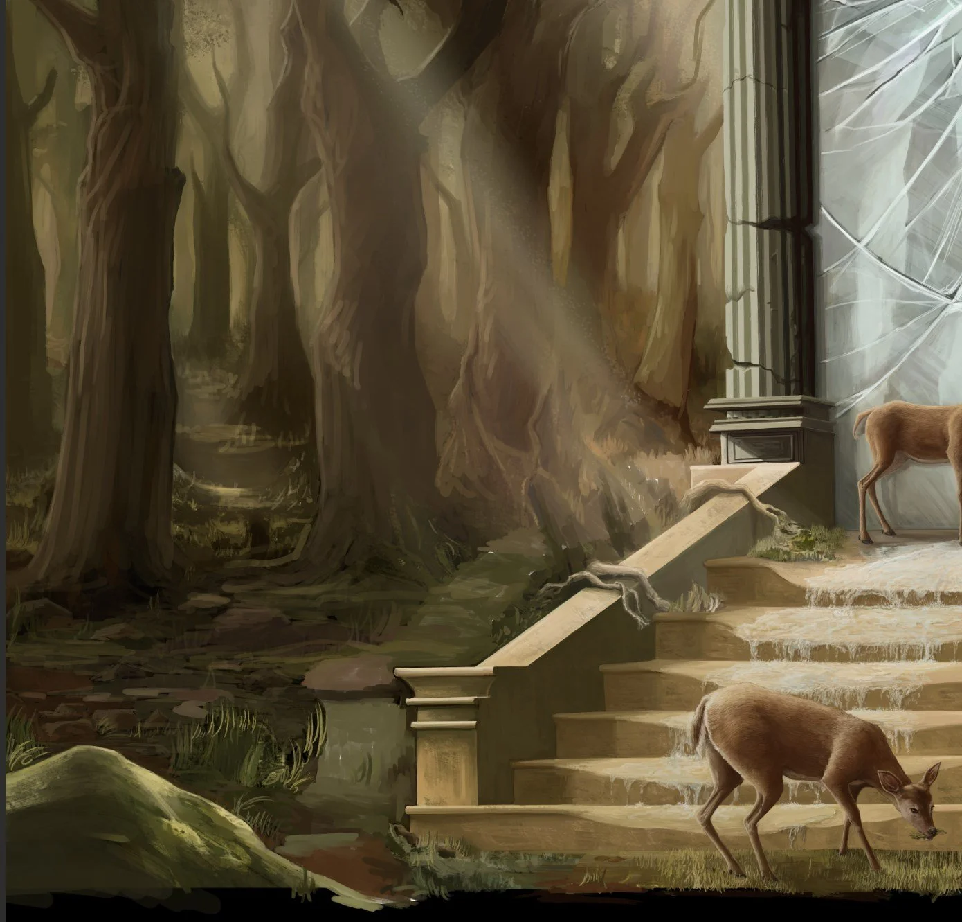
Adding individual blades of grass and all the rocks took SO LONG.
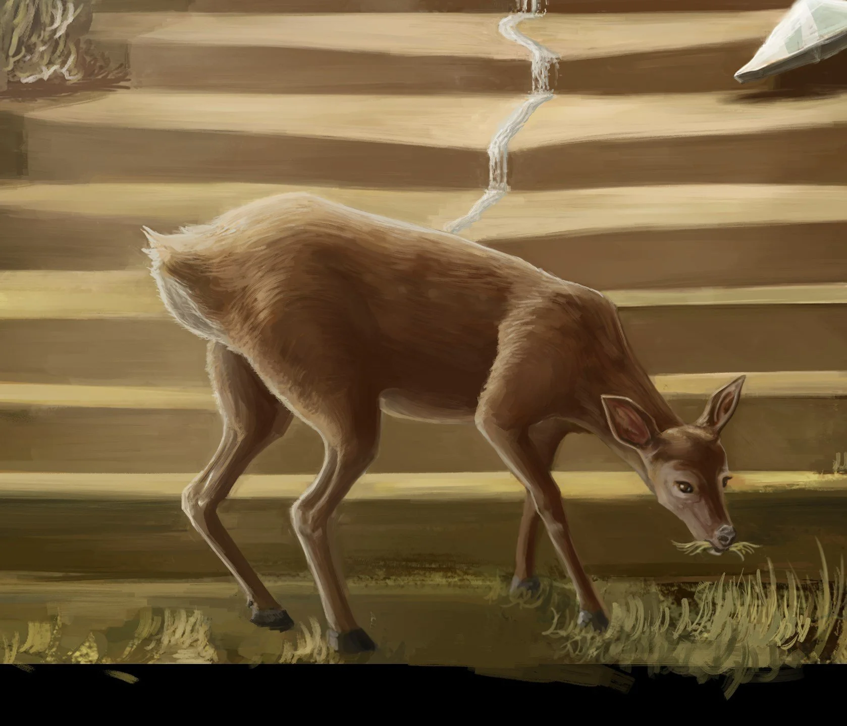
I definitely took on way more than I could chew with this giant art piece, the deer has individual hairs!
Look at the cute lil face!
On to this deer and again a painstaking amount of detail had been added, I spent so long getting the legs perfect and I'm really happy with the detail on the face.
I felt the composition could be improved by making the water running out of the mirror more prominent, and also an opportunity to have a bit of fun studying how water would fall and pool over stone steps like this!
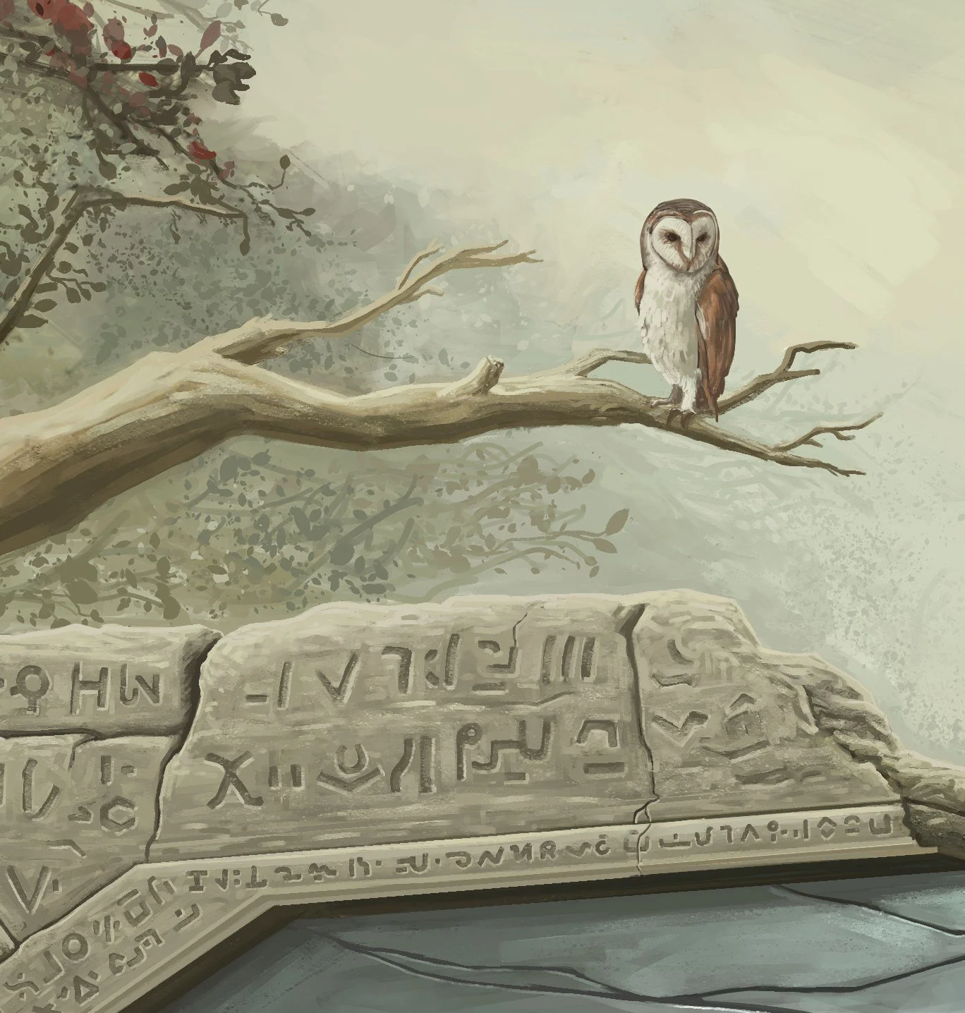
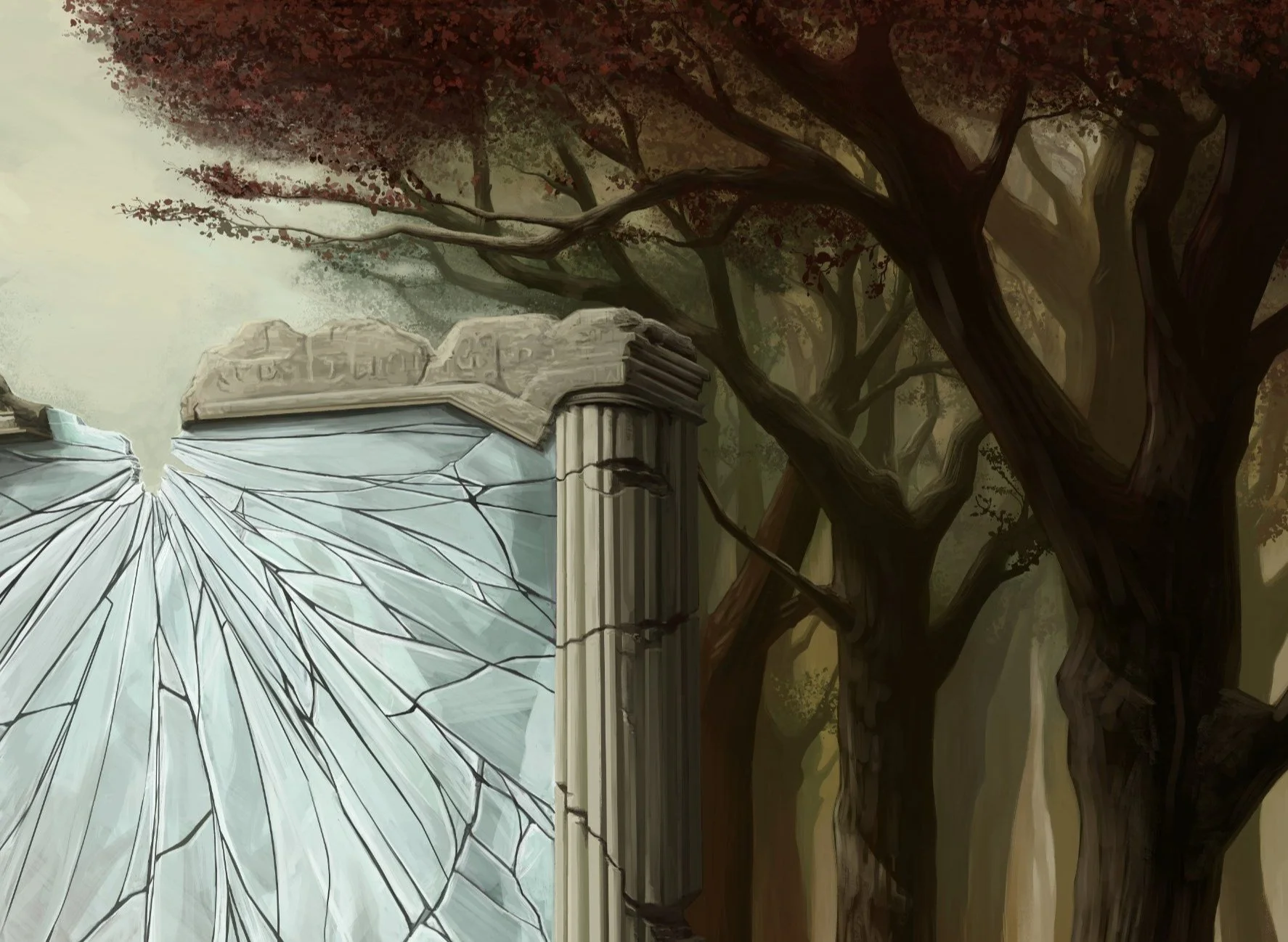
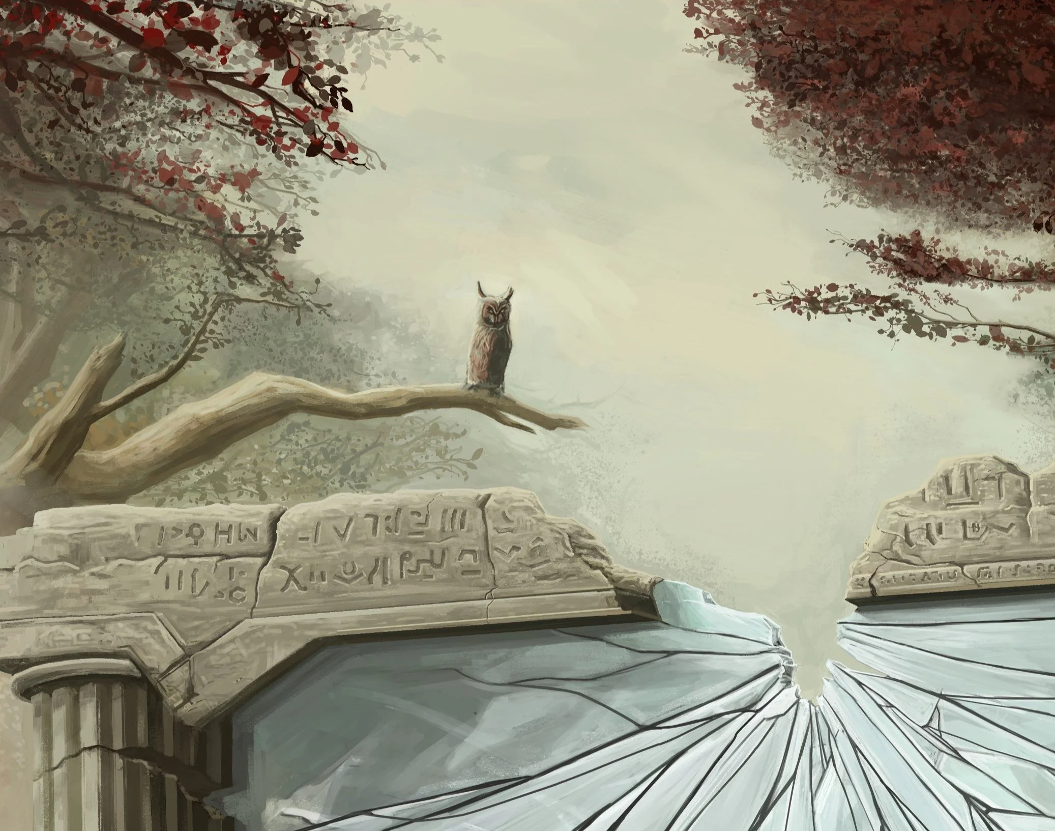
Originally I had the idea for these symbols over the top of the mirror arch, and spent a good few hours painting them in, but ultimately I felt they drew too much attention, and looked far too fancy and new for this scene, so off they go!
Let's weather the whole top column and add them back in later.
Lets work on this area some more, we need more light coming down through the trees and more foliage on the ground.
By moving the stairs to the right we also have a bit more more space to work with.
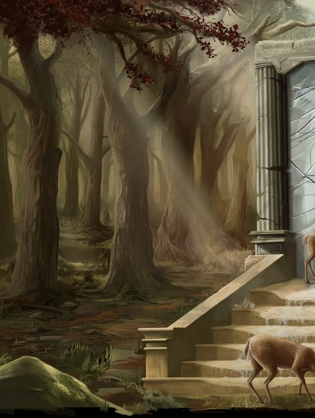
More light is coming through the trees now, (notice how dark the leftmost tree was in the images before we shifted the stairs along) but let's make it even brighter.
Those light rays piercing through the trees are starting to take shape, so now its time to work on the detail of the leaves and tops of the trees. The dark contrast helps to add more depth. Just this section alone took days and days of constant work.
An entire week was devoted to the tops of the trees and leaves in this part. I never want to draw leaves again!
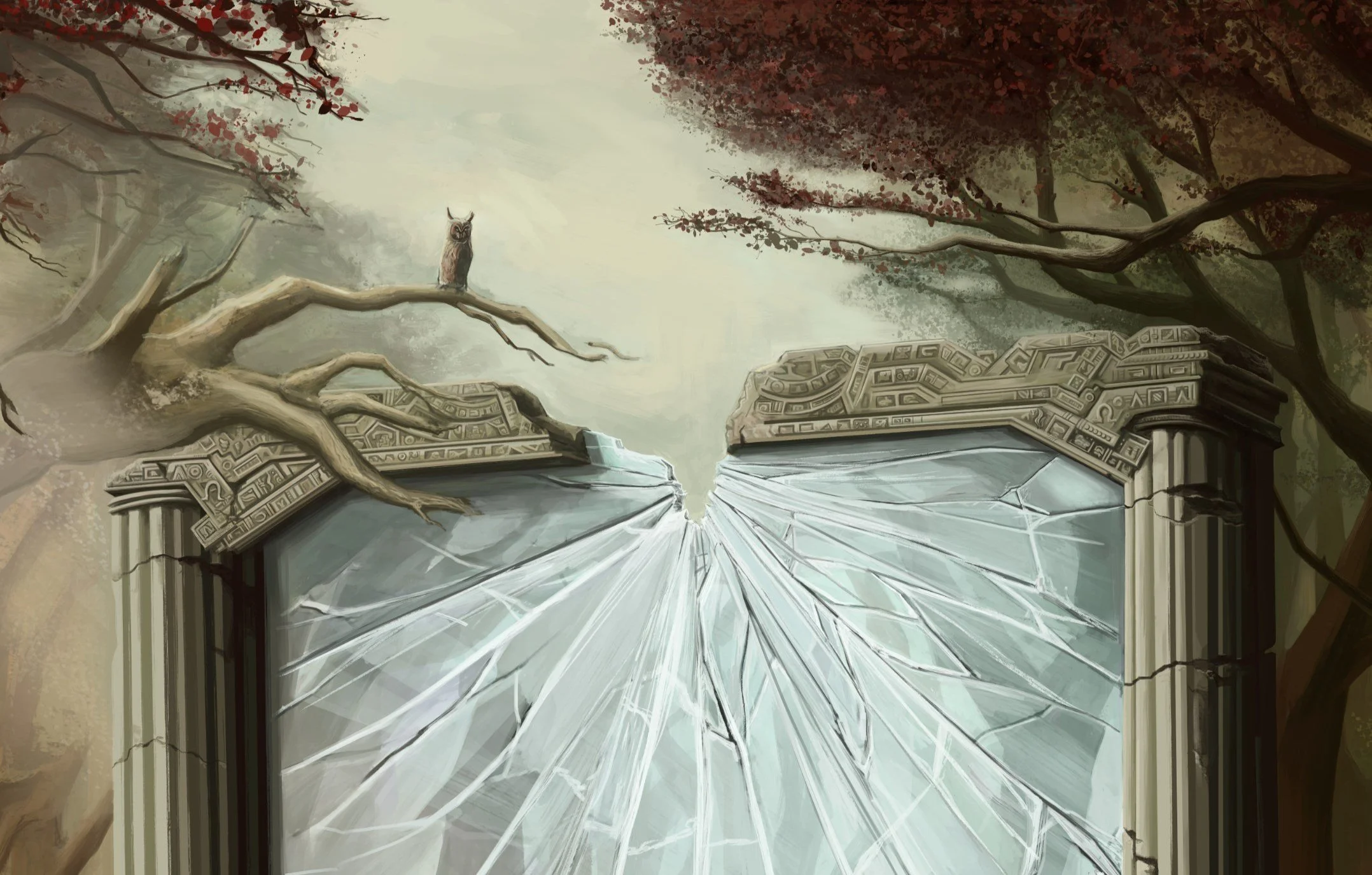
The mirror needed about three or four complete repaints to get it to look more realistic and for the cracks to look natural. Lots of researching and studying broken mirrors and glass!
The much larger 40x30 inch canvas aspect means there is now some space at the bottom that I forgot to render, so while I worked on adding more grass I thought it would be cool to have the water trickling through, a good way to lead the eye in from the bottom of the the composition.
Time to add more detail to this area…
Now let's work on the stonework. The initial sketch didn’t make much sense as a believable structure so lets fix the perspective, add some cracks and more rock texture and details to the symbols.
Some final touches to add to the rock texture and I'm finally happy with the weathered and beaten up look!
Something annoys me about this owl.
I experimented with redrawing him completely with this flying one, but it added too much motion to the top of the artwork.
This Barny boi looks good though! The more circular head reads better than the angular and pointy one in the last owl.
A few more touch ups and over a YEAR of working on and off on this after the initial sketch, and its finally DONE! What do you think?
If you would like a print of this artwork you can select your size and add it to your cart below!


