“Shelter”
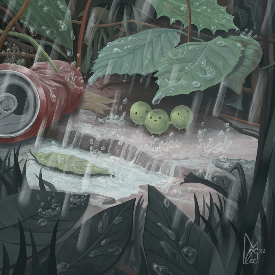
Sometimes you just have to wait it out and hope you don't get washed away. I created this little artwork to study both how to convey falling rain and the transparency of raindrops and and how they rest on various surfaces.
If you would like a print of this artwork you can select your size and add it to your cart below!
How I created it
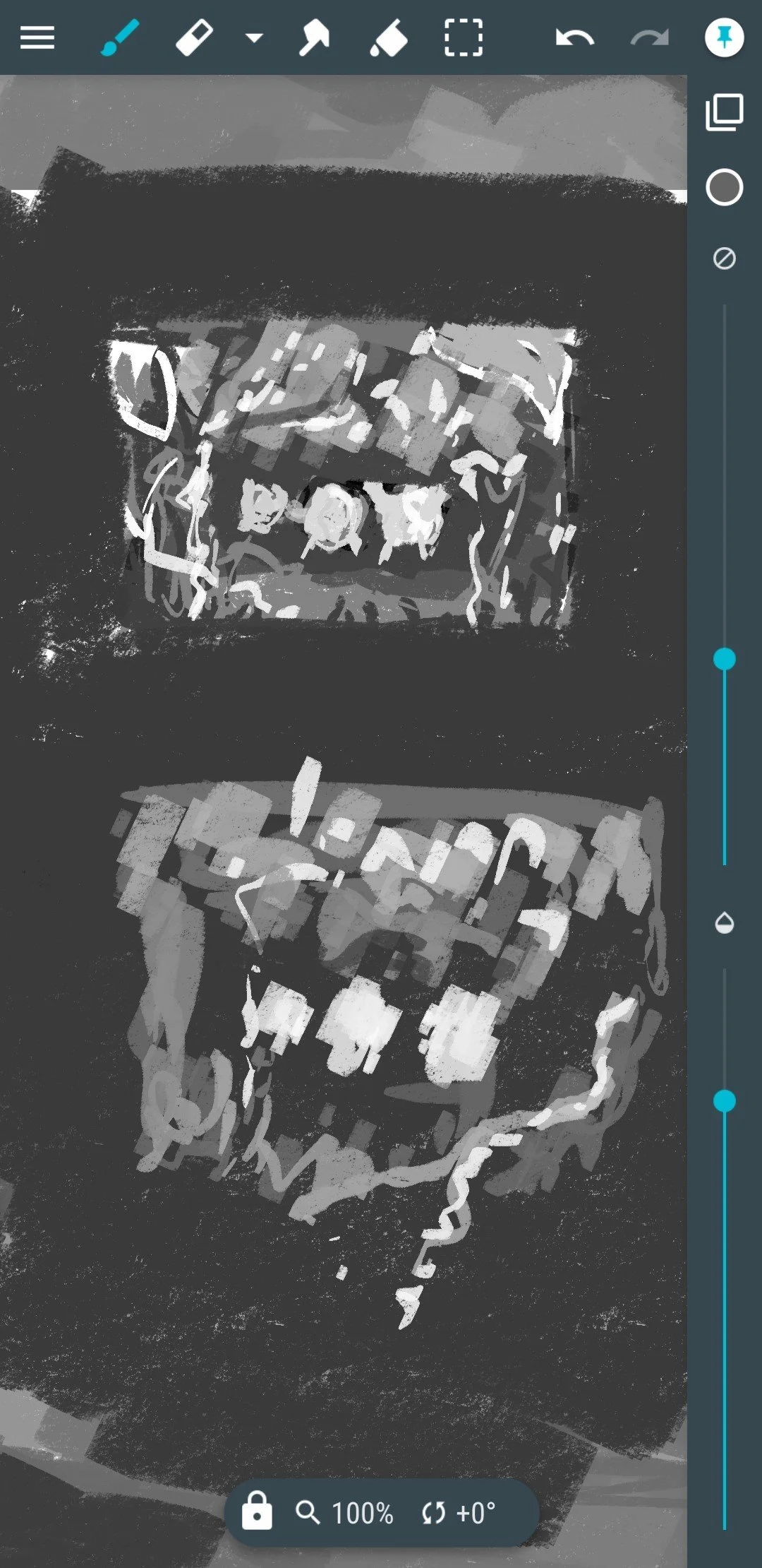
Some of my pieces start off as really abstract greyscale sketches, when I have a very vague idea of a composition in my head. In this case I actually doodled the basic idea out on my phone. I was daily driving a Samsung Note 9 at the time as it has a little stylus and Samsung paired up with Wacom to use their tech in all their style products, so it works really well for stuff like this.
Can you see the basic idea in this rough little doodle?
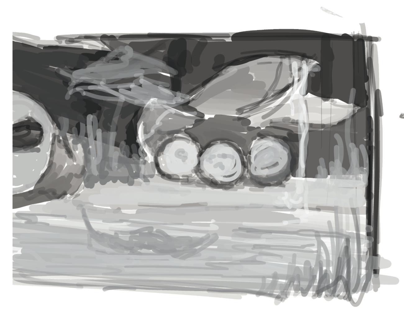
I then sketched out a few more iterations of the same basic idea, I knew I wanted something hiding in a nook, here I'm experimenting with white lines coming down to break up the dark background and add more vertical lines.
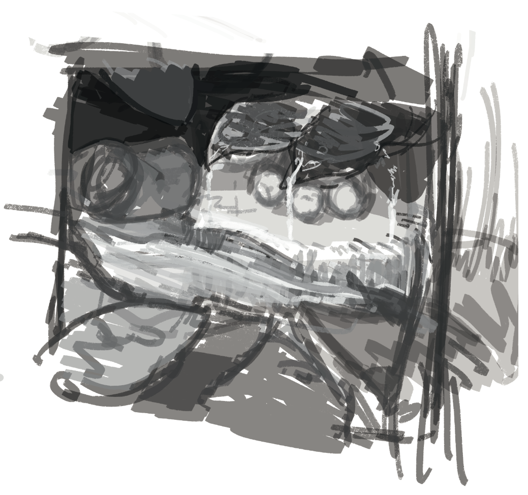
Another sketch attempt. The can on the left is added to show scale and add an idea of a location to the piece. Experimenting with leaves and grass too.
I usually work on the composition much more before I get specific with adding details or any story into my art, but I sketched out my idea for the little fantasy creatures almost immediately! I knew I wanted these cute little guys in there. It adds such a mood that I then used as the basis for the rest of the art.
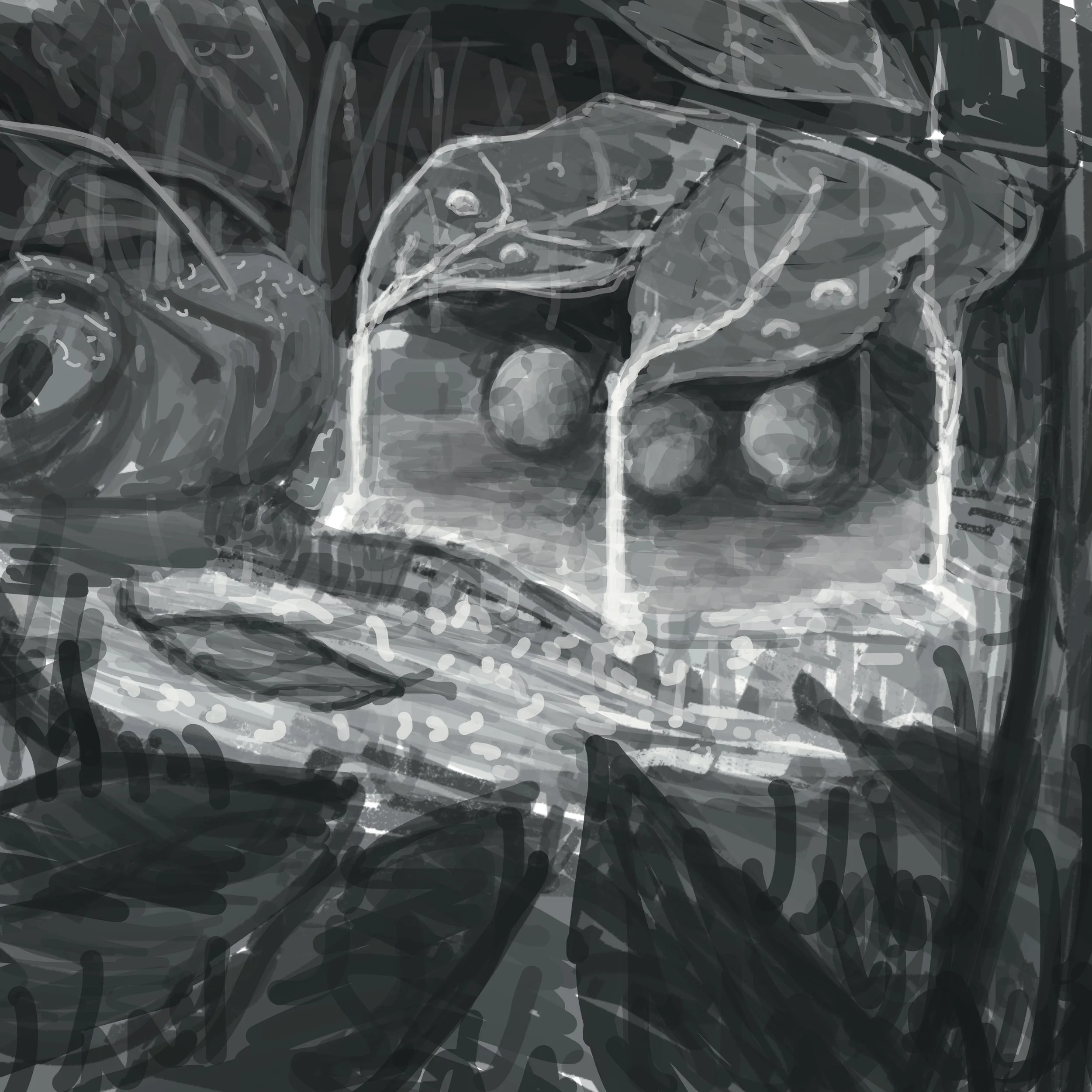
Another rough sketch and it looks like I finally found a composition I was happy with. The more top-down angle conveys a much better scale.
Keeping the canvas very rough and not focusing on detail lets you iterate rapidly. You can restart entire areas and quickly try different values for areas. Here's a test with much lighter values at the top.
I decided that looked too "open" and that darkening the surrounding area adds a more cosy and confined feeling to the whole composition. Here I push the values so that the darkest grass and flowers at the very front add some nice depth...
...Before carefully adding back values. It helps adding in the lightest areas with the rain dripping from the leaves, this draws the ete more to the area you want viewers to focus on.
Can you notice how its almost like the artwork is focusing in on the little creatures now?
Now lets push those dark values more.
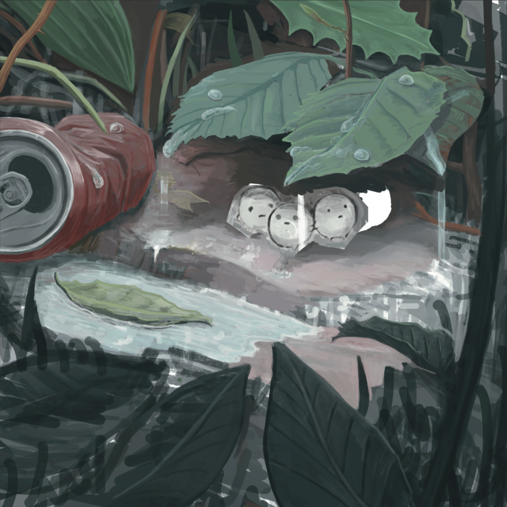
Time for a solid first attempt at adding detail and colour, I like how how muted everything is so far.
Just like values you can use saturation to lead the eye by having the little creatures be slightly more rich in colour.
Experimentation time!
I used a separate layer for the raindrops and focused on studying the way the interact with landing and splashing on things.
I struggled with conveying fast moving raindrops. Here’s a first attempt.
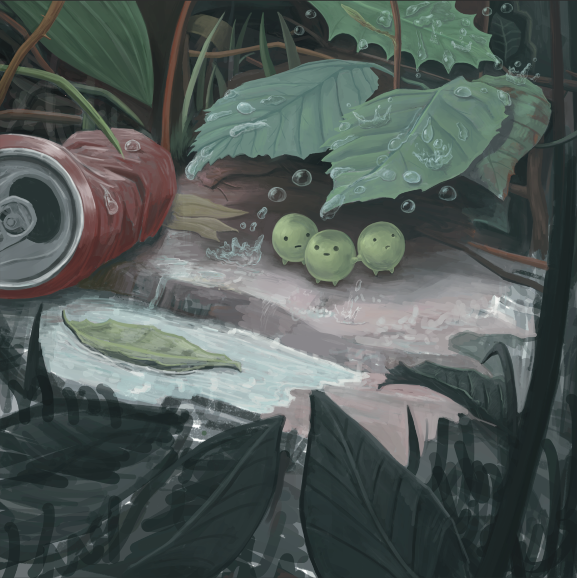
Let’s leave the rain for now and add some more detail to the leaves in the foreground.
Another attempt at the raindrops. I was focusing on adding them in a pleasing pattern of size and layout, without making the piece look too busy.
Finishing touches added to the ground and other areas before I finish working on the raindrops.
Now the raindrops can be added back in. Blur and positioning can be tweaked and individual raindrops resized to add more depth and make it really look like a shower!
A few more tweaks and raindrops added where we can and its finished! What do you think?
If you would like a print of this artwork you can select your size and add it to your cart below!


